Thursday, December 12, 2013

India Ink Painting with Gouche

     To be honest, this drawing is my favorite one is all of those. I got the original image from internet and I really love it. I sketch the outline of these houses in class and then I spent two nights working on the color part. Coloring wasn't that hard but mixing all the paints to make the color is tricky. 
     When I finished the coloring, I brought it to the class and covered it with india ink. It was kind of scary that I was afraid if some part of the color will be covered. Then I wash the whole paint under water. It is not perfect but I love the "nostalgia" and "vintage" feeling of the painting.

White Charcoal Skeleton

     I also did this skeleton sketching in the very beginning of the semester. I used white charcoal to draw on a piece of black paper. The white charcoal has a really weird texture and that is my favorite part of it.
     The skull looks kind of weird. I feel like I can do better with the shadows. But I actually like the lower part of this drawing.

Candy Wrapper

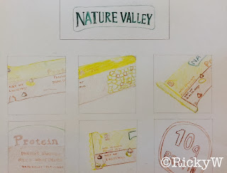
      This drawing is called Candy Wrapper. I brought an energy bar and I was drawing it. For each square, I tried to find a different prospective. Also, I carefully drew out the label.
      But, I can actually have more prospective, and for the last square, my circle can be more round.
      I really like the color of it though.

Free Candid Portrait

      I had a hard time trying to find a friend of mine to draw. In the end, I chose Anissa. She is totally adorable with sweet smile. Because in the last drawing I did ink paint, and it comes out pretty well; then I chose china ink again. However maybe I chose the wrong picture of her, plus my drawing is not skillful enough, the image is not as good. 
     Meantime, a weak background is my disadvantage. So this painting did not get a good grade. I really want to improve it next semester. 

Ink Portrait-High Contrast


     This is a high contrast portrait I did of myself. Thank to Karry for taking me this great photo so that I had a good start. I trace the line with light box and paint the dark part with china ink. I really like the texture of china ink and applying it to the drawing is really interesting.
     Unfortunately, my background is much weaker than the drawing part. I really hope to improve that next semester in Art II class.

Alphabet City

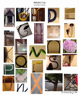
     I was really happy when I got to know that we have a photography assignment, because I am really really not good at painting. However, the very fact is, this assignment is not as easy as I think it is.
     We went over all most the whole campus on a windy day. I took picture of the building, chairs, sofa and anything with a shape of letters. Also, I continue the work at home. Finally, I took all 26 letters.

Gray Cones with Colored Cloth


      This is called Gray Cones with Colored Cloth. I draw the cone first with pencil and then paint it. I am never good at doing shadow.  With no surprise, this drawing did not come good. I also painted the background blue. And because of shadow, you can see the blue goes from lighter to darker.

Black & White Chairs


     This is the Black & White Chair drawing I did in the very beginning of the semester. I sketched the chair first and then draw two lines dividing up the whole image. After that I painted the each part black and white. 
     The bottom of the chair looks pretty good but the top part is kind of mess up. Meanwhile, applying the paint is not that easy since I had to make the line very clear.
     But I really like this kind of method of drawing.